Implementing a data visualization feature in a B2B SaaS product within the Generative AI era: How to overcome obstacles to deliver powerful insights.

By: Haitam Zoukaghe, Product Manager, Zelros
Implementing a data visualization feature in vertical SaaS products presents unique challenges
An analytic feature has emerged as a powerful tool for domain-specific businesses to gain valuable insights into user behavior, identify trends, and make data-driven decisions. By tracking user interactions with the product, SaaS companies can gather vast amounts of data and transform it into actionable intelligence. However, implementing a data visualization feature in an insurance SaaS product is a complex endeavor that poses multiple challenges for organizations. From technical complexities to privacy concerns, there are several obstacles that must be overcome to deliver powerful insights.
Zelros decided to embrace the occasion to share challenges associated with implementing an analytic feature within its SaaS product for insurers and propose strategies to enable businesses to harness the full potential of their data.
Understand the need and build stakeholder alignment
While it may be obvious, this exercise is demanding. Our team iterated and refined multiple versions to align our solution with diverse customer experiences.
The motivations behind incorporating a data visualization feature are more varied than initially perceived. To effectively address crucial pain points and provide substantial user value, it’s imperative to pinpoint key customer requirements. Thorough research, user feedback, and behavioral analysis are no longer optional but essential steps in comprehending the fundamental need driving the data visualization service’s evolution. In our insurance context, users include heads of life and P&C insurance distribution, leaders driving agent/advisor enablement, and digital insurance marketers.
What is it that your customer truly seeks from a data visualization functionality?
Whether it’s improving data comprehension, aiding decision-making, spotting trends, enhancing communication, or boosting user engagement, aligning the feature’s development with these core needs optimizes resource allocation for a precise and impactful solution.
Harness existing data visualization tools to drive transformation
As organizations strive to bridge the gap between numerical data and linguistic communication, a pivotal choice emerges: should they adopt prevailing data visualization solutions or create their own? Both approaches have their advantages.
Using existing data visualization products is a good shot. These products are often mature, feature-rich, and widely adopted, providing a solid foundation for implementing data visualization capabilities. Tapping into these established tools can result in substantial resource savings.
Nonetheless, at Zelros, we adopted a different approach:
“At Zelros, we are convinced that creating a custom data visualization tool from scratch allows organizations to tailor the solution precisely to their unique needs and requirements. In our case it provides the flexibility to design a tool that aligns perfectly with our product vision of harnessing the power of generative AI.”
So we accepted the challenge with open arms and decided to create our own data visualization solution. It has been an exploration that opened up many possibilities, in particular, the integration of LLM (large language models) into our analytics section.
Analytics dashboard feature: the UX & UI challenge
The effectiveness of a data visualization feature hinges significantly on the excellence of its user experience (UX) and user interface (UI). While the core data and insights are undeniably vital, the manner in which they’re showcased and interacted with holds the key to effectively conveying information and enhancing user engagement. As John Tukey said:
“The greatest value of a picture is when it forces us to notice what we never expected to see.”
For Zelros, the key has been to tailor the specific visualization to its data, audience, and context rather than following holy data visualization rules. A few key points:
Design empathy – The human eye and mind are more adept at perceiving differences in lengths or positions rather than angles. Therefore, it is crucial to consider what data you want to visualize and determine the most effective way to present it.
Simplify as much as possible: user-centric dashboard – We are convinced that, particularly for this feature, the design of dashboards will be a factor that drives adoption. Many advanced visualization tools offer a wide range of features, but this often leads to overly complex visualizations. Simplify the design and focus on strategic details, such as colors, number of charts, and placements to maintain a clear dashboard, is the priority for us.
Smart insights really make a difference
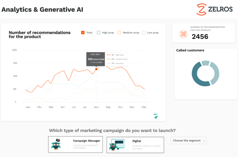
Narrowing down the ideal data for presentation within the analytics section has been a journey. The challenge of finding smart insights remains to measure the most information and show the least, while ensuring relevancy. In our case, we selected around 25 insurance-specific insights such as the number of policyholders engaged through the platform, the average number of recommendations per policyholder, and the recommendation breakdown by insurance product (legal protection, motor, life accident, term life, etc. …).
By the way, what are smart insights? Here are some key considerations:
Tell a coherent story – The consensus among Zelrosians was crystal clear: a cohesive narrative is imperative! To captivate your audience, your data visualization must weave a compelling story. It extends beyond mere figures and graphs; its purpose is to convey a tale that leads the audience through the data, enabling them to unearth valuable insights. A smart insight is focused, actionable, contextual, and often predictive/prescriptive.
The power of Machine Learning (ML) for analytics – When it comes to implementing feature analytics in SaaS products, harnessing the power of machine learning (ML) can be a game-changer. ML algorithms can process and analyze massive datasets much faster and more efficiently than traditional methods: automatically detect complex patterns, correlations, and anomalies within the data, even when they are not explicitly defined. It allows us to uncover valuable insights that may have otherwise gone unnoticed, providing a deeper understanding of data.
At Zelros, ML studies serve as a powerful framework for generating smart insights. Predictive churn studies and propensity models have consistently demonstrated their effectiveness in identifying significant missed targeting opportunities for insurers regarding their customers. Additionally, cohort studies and correlation analysis can be instrumental in determining the bundle of subscribed products that boost customer retention.
Don’t rush! Have you thought about strong statistics? – Like all the features you develop, the data visualization feature also starts with its initial version. It’s important not to rush into it immediately. While machine learning models and algorithms have rightfully garnered substantial attention in recent times, there are situations where solid statistics alone can wield tremendous influence. Statistics possesses the remarkable ability to extract valuable insights and guide well-informed decision-making.
The right data at the right place and in the right context, simple yet robust, can provide valuable insights without unnecessary complexity, contributing to the success of data-driven endeavors.
Do not be blind to LLM : The new era of Data visualization
In this breakthrough era of generative AI, it is imperative not to overlook the potential of LLM (Large Language Models). As data visualization evolves, LLM emerges as a powerful tool that enhances the capabilities and effectiveness of data visualization techniques.
Can LLMs analyze data? Here is an article that can raise your awareness about what can be done today, particularly with the release of the code interpreter plugin by OpenAI.
Undoubtedly, the emergence of AI opens up new possibilities for data visualization.
- For instance, generative AI can generate synthetic data points that fill in the gaps in sparse datasets, allowing for more comprehensive and accurate visualizations.
- One exciting aspect Zelros already works on is the potential for dynamic dashboards that are generated on request. This concept of dynamic dashboards generated on user request revolves around leveraging AI algorithms to analyze user input and generate customized visualizations in real-time.
Here is a first draft of what is possible with Zelros :
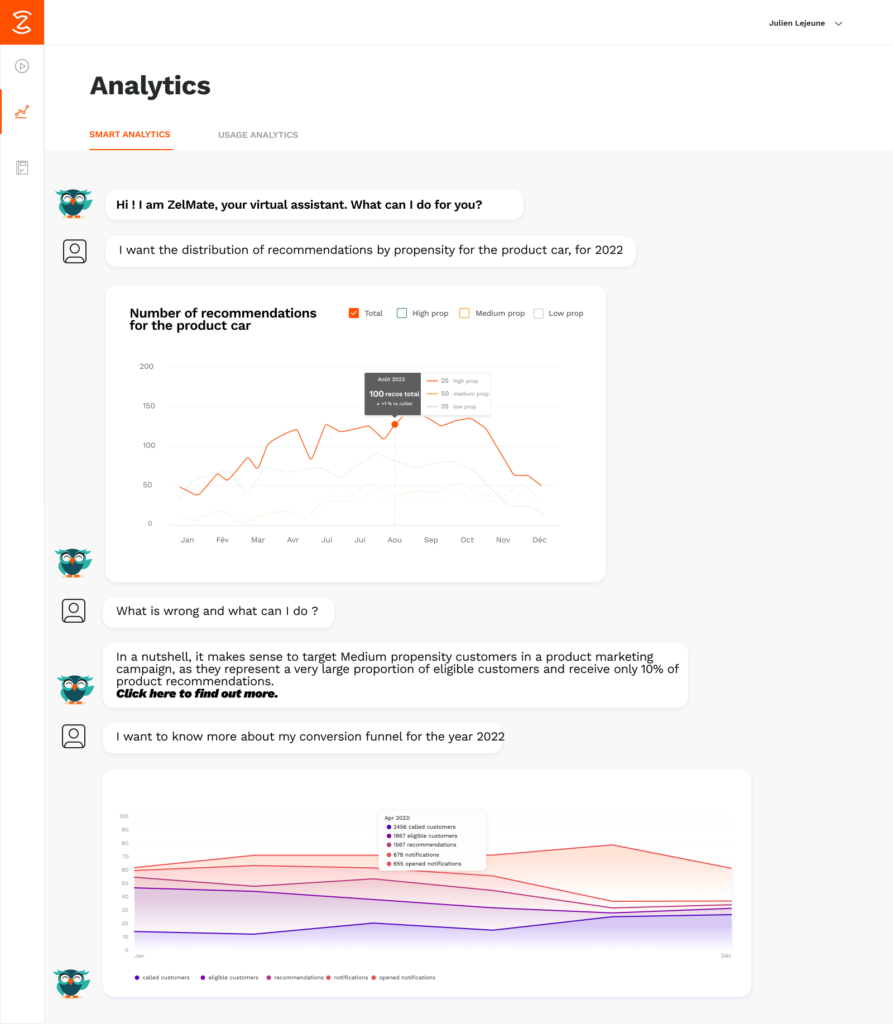
This capability offers several advantages, including a highly personalized and interactive experience. Promising, isn’t it? If you want to know more about Zelros’ roadmap with generative AI, please go to this article.
And if you’re still in any doubt about the need for a data visualization feature on your product, remember that what can not be measured does not exist. Note that at all times, a BtoB SaaS product’s value is greatly enhanced when it is supported by a monitored vision of its performance.
Any other questions?
Do not hesitate to ask the Zelros product team by simply contacting us